So another week means another dropbox, and more work on the web assessment – during the week I made some wire-frames that change size and dimensions depending on what size screen you are on so Mobile and Desktop views.
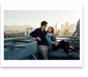
They aren’t the prettiest of wire-frames mostly consisting of basic border boxes that are black and with a back ground that is white – the font sizes aren’t final as well they are just place holder, along with the homepage I have at the moment put 4 images, they look the same but when it comes time to enter pictures onto the website two will be landscape with the other two being portrait (well that’s the plan let’s hope my skill level will let me haha)
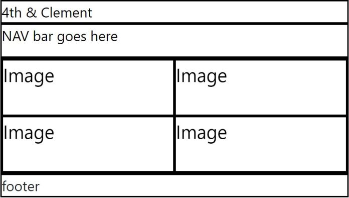
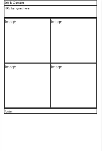
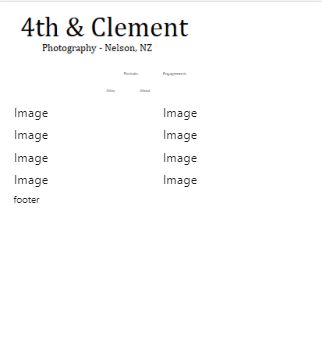
Here are the screenshots of the basic wire-frames in their mobile and desktop forms – just a note that when the website is live the black border-box’s will be changed to white this is to just show the columns and rows along with place holder text.
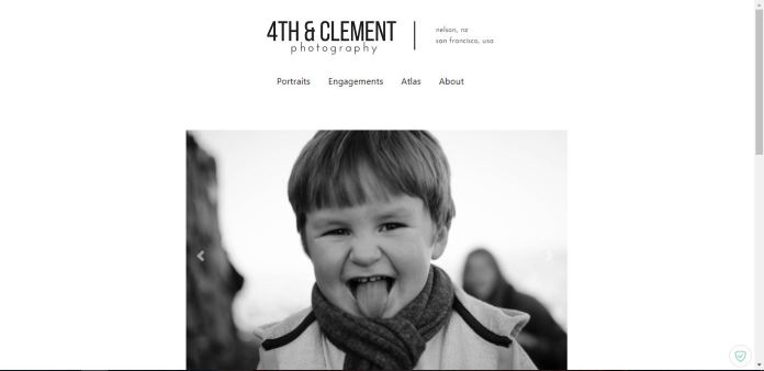
Home Page Desktop view.
Mobile View:
Classes:
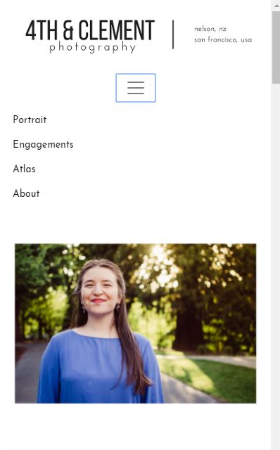
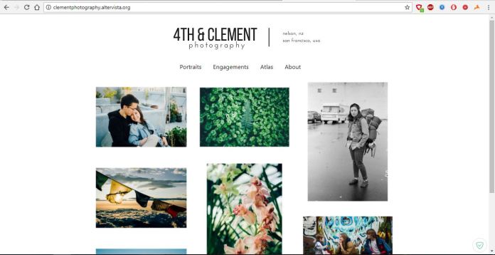
- .headerhomepage 4th & Clement – this will be in a large text, this is the main title of the page and will continue the same design through all the pages at the moment the font is Segoe UI – but this could change to a different font in the future – once the photo’s are in it could clash – the title will be bolder as its the name of the company, the font colour will be black.
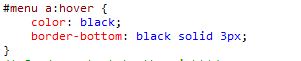
- .navhomepage – a simple nav bar that will still the same through out the design it will have the category names along with a underline for example – Portraits hopefully these will go bigger on hover of the mouse cursor the font used on the nav bar again will be Segoe UI.
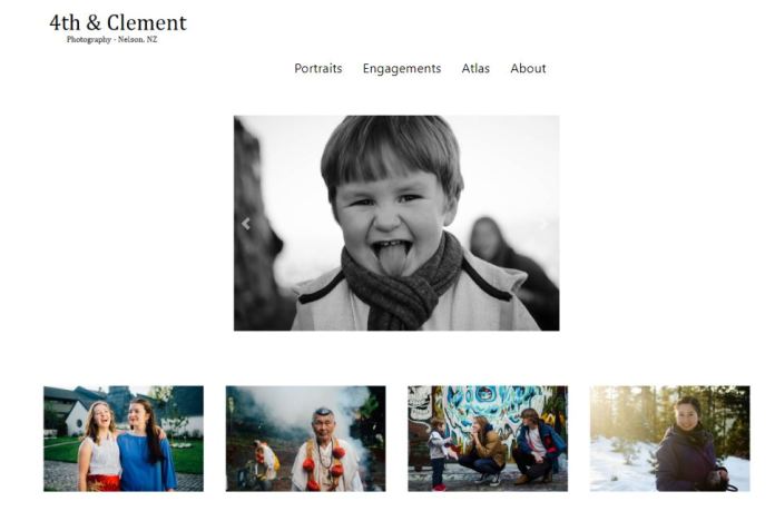
- .imageboxhome – these will be four images that will fit the content image hopefully two will be portrait and the other two will be landscapes, the images in the boxes will be landscapes and images in the portrait will be portraits font size will change depending on the size of the screen
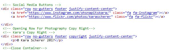
- .footerhome – a footer that will contain copyright and a instagram logo which will then send the user to the 4th & Clement instagram – the font for copyright will be in segoe ui and be in black the font size will change depending on the size of the screen.
The Nav bar will stay the same throughout the design.
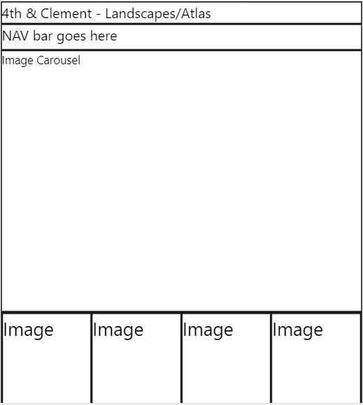
Landscape Category Page:
Mobile Landscape Category Page:
Classes:
- .headerlandscapes – again this will hold the title which will stay the same as the title on the homepage with the only thing changing is the last part which will say the category so for instance – 4th & Clement Landscapes.
- .navbarlandscapes – this will stay the same thoughout the whole (font and font size and all other elements that was mentioned in the homepage nav class description) the only thing that will change is what ever category you are on will be bigger and bold.
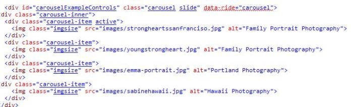
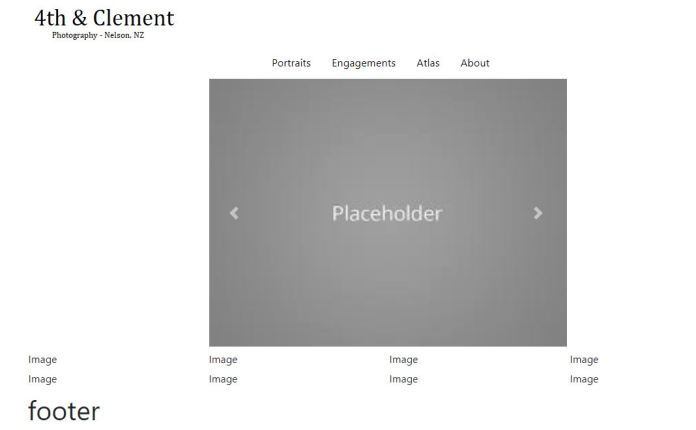
- .carousellandscapes – this is an image carousel that will display images on a timer – it will be a set number of images depending on what category you are in as the screen gets smaller and onto mobile mode the carousel will disappear – this is to save on screen space and loading times.
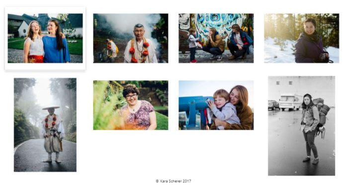
- .imageboxlandscapes – images will be displayed under the carousel so the user can jump to them – this is so they can pick what photo to look at – hopefully when the user clicks on it the image will enlarge, the images under the carousel on mobile and desktop will be a four images together and then another four underneath.
- .footerlandscapes – a footer that will contain copyright and a instagram logo which will then send the user to the 4th & Clement instagram – the font for copyright will be in segoe ui and be in black the font size will change depending on the size of the screen.
The footer again will stay the same on all the pages just like the nav bar does.
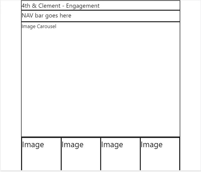
Engagement Desktop View
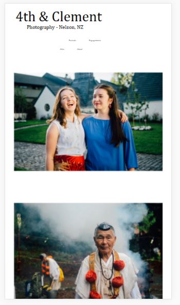
Engagement Mobile View:
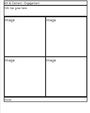
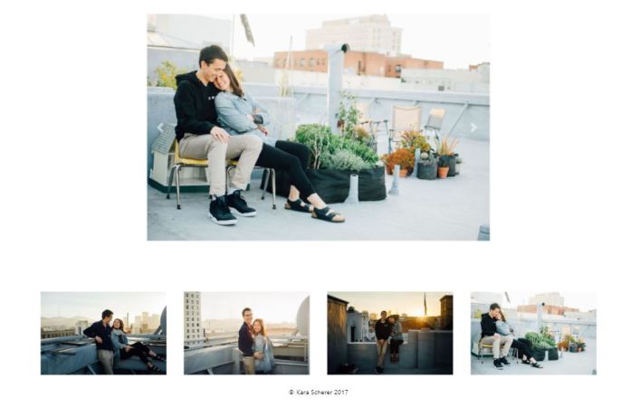
As you can see the classes for this page a mostly the same as the other category pages as this is the design I’m going for as I hope the images and the layout of the images and the minimalist approach will make the website look great.
Classes:
.headerengagement – the header attributes will stay the same on previous ones apart from the title being 4th & Clement Engagement.
.navengagements – the nav bar stays the same throughout the design, again depending on what category you are it will be bigger on the nav bar.
.carousel – this will disappear like on the other categories when you go to mobile, the design will be consistent throughout the website.
.imgcolengagement – this is the column for all the images on the website and is used for all the different pages where an image is required, this will help with the resizing of images making it more responsive.
.imageboxengagement – stays the same throughout the website, the user can click on an image they want and when they click on it will resize, images in these will change depending on what
.footerengagement – this holds copyright, example (copyright 4th & Clement) – and it will have the Instagram logo as well that will link to the Instagram.
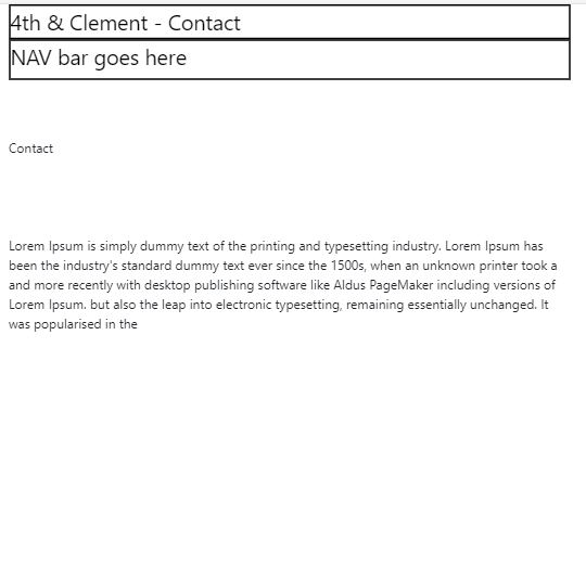
Contact desktop view.
Contact Mobile:
Classes:
.header – Title with 4th & Clement Contact in a bold size 24 Sugoe UI Black Font.
.nav – Same as on the other pages when on the contact page the contact part of the nav bar will be larger then the rest.
.paragraph – this will be smaller font then the title at a standard 14 size font and it will segoe UI black font – this will contain contact information for example an email address.
.footer – the footer stays the same all the way through the website and will continue to hold the copy right and the Instagram link.
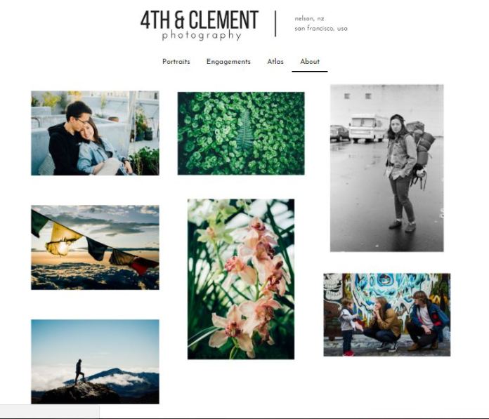
Each page I have has its own css which will make it easy to make changes to and t update information on without messing up the overall website as a whole, each category for the photos has the same layout with just the title page and the photo’s in the carousel changing and the galleries, I want to keep the same design throughout the design so it will be tidy and minimal as I want the photo’s to do the talking.
One thing that could change is having a little about some of the photo’s on the website which tell the user where and what happened during that photo, once I have that finalized with the client I can then up date my wire-frames and blog about it at the same time.
I think with the white background and the simple but clean black font will be a good fit for the website.


 NMIT - IT